Charts
Chart types
1. Bar chart of average values across a number of categories
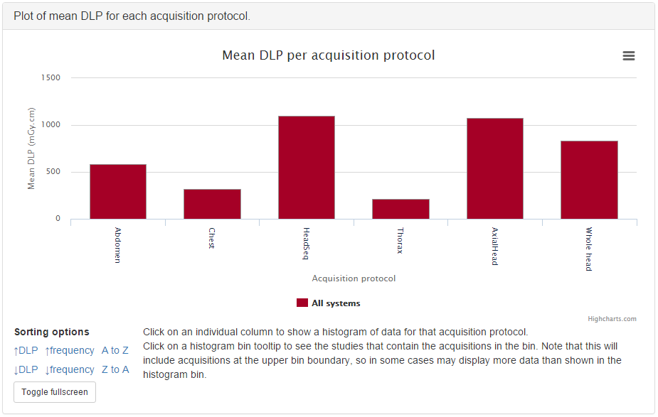
Figure 1: Bar chart of mean DLP per acquisition
An example of mean DAP per acquisition type is shown in figure 1.
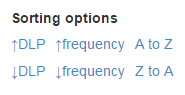
Figure 2: Bar chart sorting options
Below each bar chart there are options to sort the order of the data. This can be ascending or descending by average value, size of data sample, or alphabetically (figure 2).
Clicking on an entry in the bar chart legend toggles the display of the corresponding series on the chart.
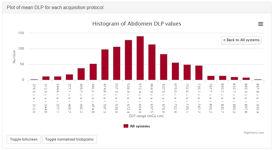
Figure 3: Histogram of abdomen DLP values
Clicking on an individual data point on a bar chart will take you to a histogram of the data for that point so that you can see the shape of the value’s distribution (figure 3).
Bar charts can be plotted with a series per x-ray system (figure 4). This can be toggled using the Plot a series per system checkbox in the Chart options.
Clicking the left-hand mouse button on the chart background and dragging left
or right selects part of the series. Releasing the mouse button zooms in on
this selection. A Reset zoom button appears when zoomed in: clicking this
resets the chart so that the full series can be seen again. The zoom feature
works on both the main series and the histograms. The zooming can be useful
when there is a category on the chart that has a very low value compared to
others. Zooming in on this category will enable the low values to be seen, as
the chart rescales the y-axis after the zoom.
Figure 4: Bar chart of mean DLP (one system per series)
If the the bar chart that you are viewing shows more than one series then clicking on a category name on the x-axis will take you to a plot that shows multiple histograms: one for each series (figure 5).
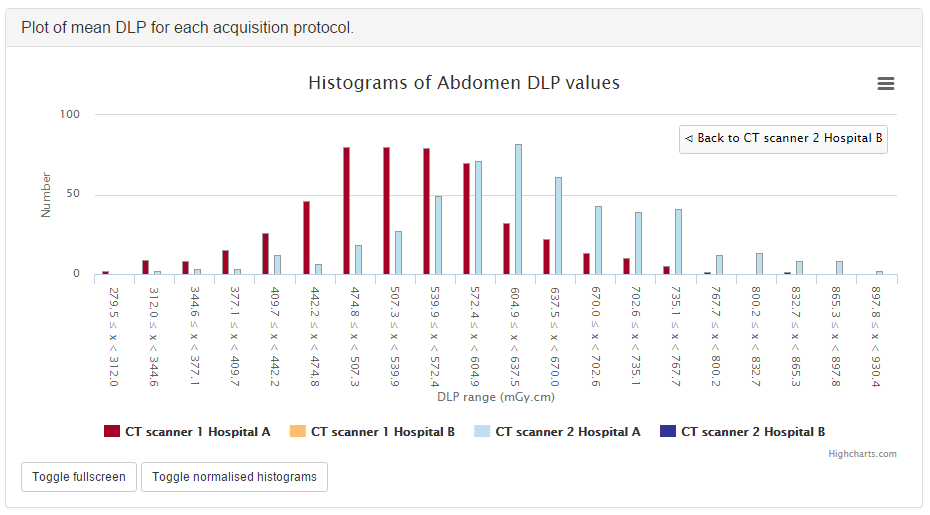
Figure 5: Histogram of abdomen DLP values, one series per system
The histogram data can be plotted as absolute values, or be normalised to a value of 1.0 (figure 6). This can be toggled by clicking on the button that is shown below the histogram plots. The normalisation can be useful when trying to compare the shape of several histograms, especially when some histograms have much less data than others.

Figure 6: Normalised histogram of abdomen DLP, one series per system
Each histogram data point includes a text link that appears when the mouse pointer moves over it. Clicking on this link will filter the displayed studies, showing those that correspond to what is contained in the histogram bin.
Clicking on a legend entry toggles the visibility of the corresponding series.
2. Pie chart showing the frequency of each item in a category
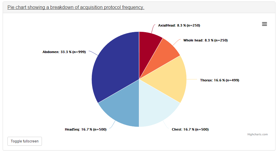
Figure 7: Pie chart of acquisition frequency
Figure 7 shows a pie chart of the number of acquisitions made for every acquisition protocol present in the tabulated data.
Clicking on any of the pie chart segments will filter the displayed studies, showing only the studies that correspond to what is contained in that segment. As for the bar charts, this doesn’t work perfectly, as the category filtering isn’t exact.
3. Line chart showing how an average value changes over time
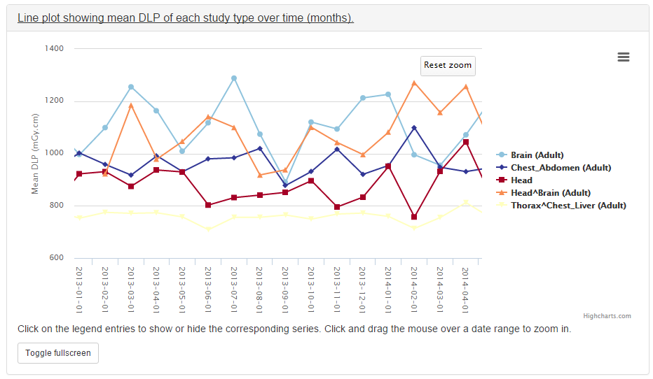
Figure 8: Line chart of mean DLP per study type over time
A line is plotted for each category, with a point calculated every day, week, month or year. This can be a good way of looking at how things have changed over time. For example, the mean DLP of each study type, calculated with a data point per month is shown in figure 8.
Clicking the left-hand mouse button on the chart and dragging left or right across a range of dates and then releasing the mouse button will zoom in on that selection.
Clicking on a legend entry toggles the visibility of the corresponding series.
4. Pie chart showing the number of events per day of the week
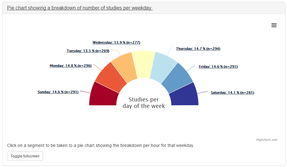
Figure 9: Pie chart of study workload per day of the week
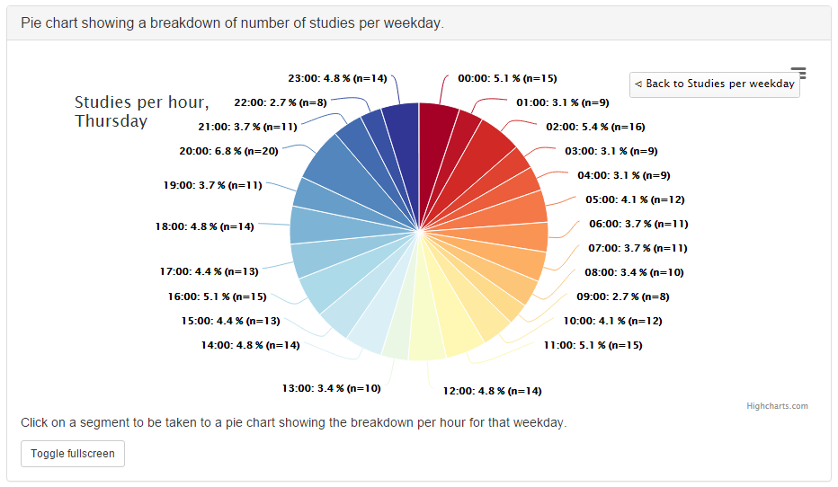
Figure 10: Pie chart of study workload per hour in a day
Each segment represents a day of the week, and shows the number of events that have taken place on that day (figure 9). Clicking on one of the segments will take you to a pie chart that shows the number of events per on that day (figure 10).
5. Scatter plot showing one value vs. another
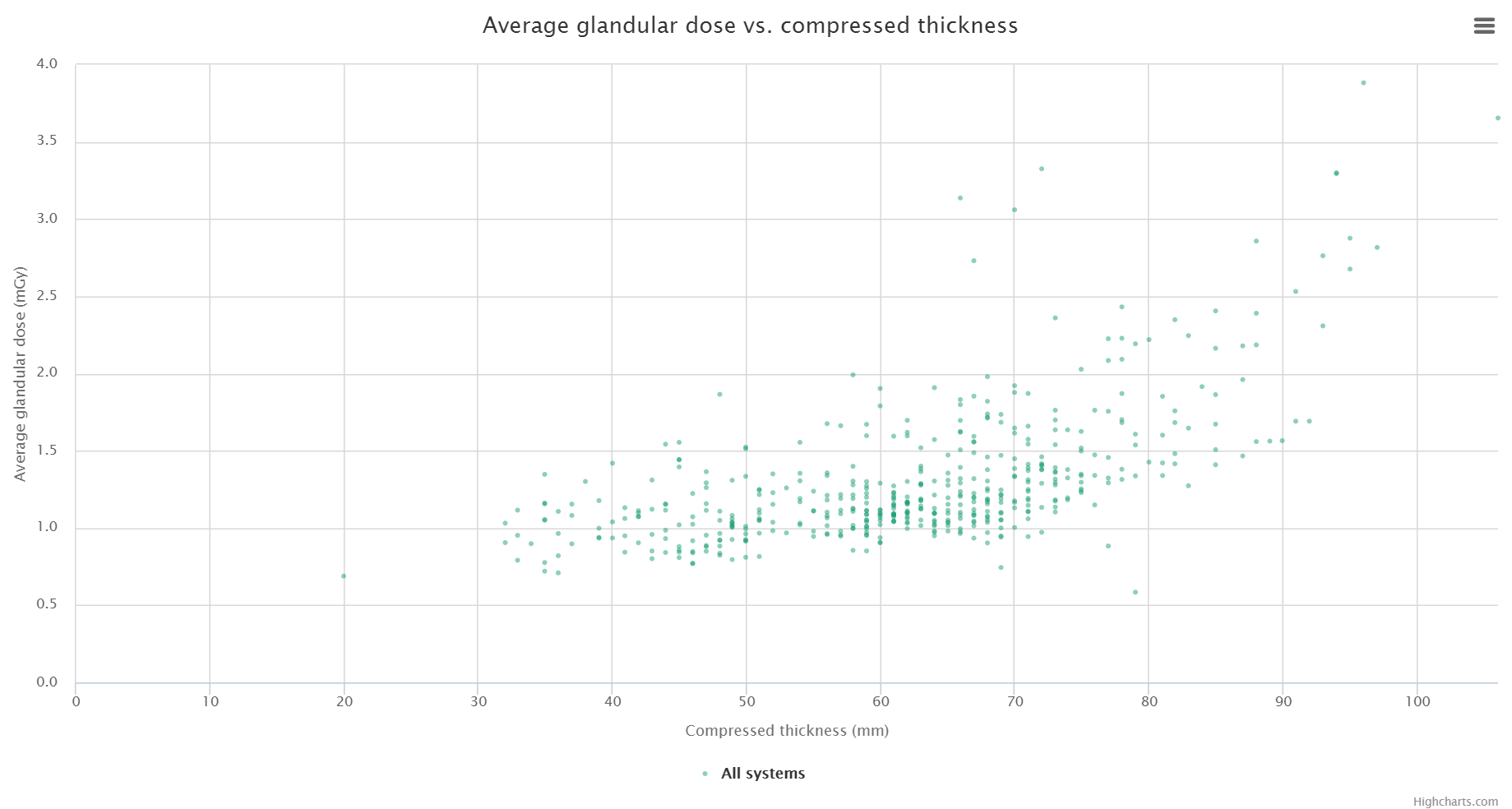
Figure 11: Scatter plot of average glandular dose vs. compressed thickness
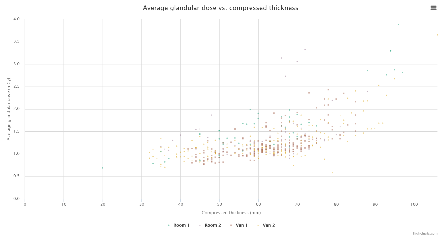
Figure 12: Scatter plot of average glandular dose vs. compressed thickness; one series per system
This plot type shows a data point per event (figure 11). The series name and data values are shown when the mouse cursor is positioned over a data point.
These can be plotted with a series per x-ray system (figure 12). This can be toggled using the Plot a series per system checkbox in the Chart options.
Clicking the left-hand mouse button on the chart and dragging a rectangular
region will zoom in on that selection of the chart. A Reset zoom button
appears when zoomed in: clicking this resets the chart so that the full series
can be seen again.
Clicking on a system’s legend entry toggles the display of the corresponding series on the chart.
Exporting chart data
An image file of a chart can be saved using the menu in the top-right hand side of any of the charts. The same menu can be used to save the data used to plot a chart: the data can be downloaded in either csv or xls format.
New in 0.7.0
- Charts for fluoroscopy and mammography.
- New scatter plot chart type.
- Chart plotting options can be configured by choosing
Chart optionsfrom theUser optionsmenu at the top of the OpenREM homepage. - Chart average values can be set to either mean or median. Bar charts can be configured to plot both mean and median values as seperate series.
- Bar charts can be plotted with a series per x-ray system. This option can be
switched on or off via the
Chart options. - The number of histogram data bins can be set to a value between 2 and 40
in
Chart options. The default value is 20. - Histogram calculation can be switched on or off in
Chart options. The default is off. Performance is significantly better when set to off. - Histogram plots can toggle between absolute or normalised values via the
Toggle Normalised histogramsbutton that is visible when viewing a histogram plot. - The data in the bar charts can be sorted interactively by clicking on the
sorting options below the individual chart. The default sorting type and
direction can be set by choosing the
Chart optionsitem from theUser optionsmenu on the OpenREM homepage. - Individual charts can be displayed full-screen by clicking on the
Toggle fullscreenbutton that is positioned below each chart. - The chart plotting status is displayed on the OpenREM homepage.
- The colours used for plotting have been updated.
Chart options
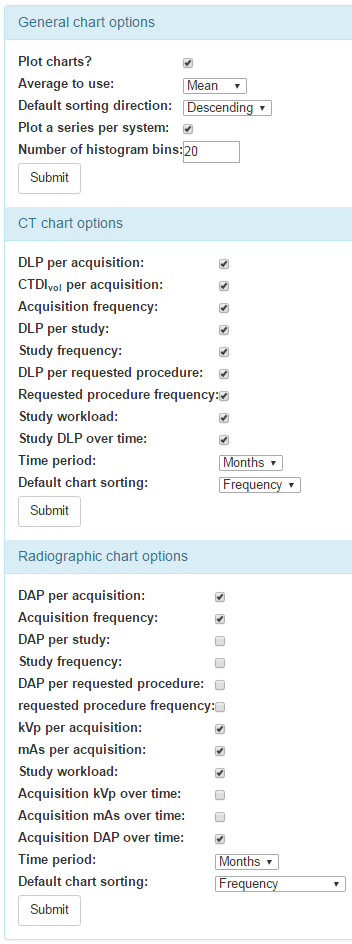
Figure 13: OpenREM chart options
Chart options can be configured by choosing the Chart options item from the
User options menu on the OpenREM homepage (figure 13).
CT and radiographic plot options can also be set from their respective summary pages.
The first option, Plot charts?, determines whether any plots are shown.
This also controls whether the data for the plots is calculated by OpenREM.
Some plot data is slow to calculate when there is a large amount of data: some
users may prefer to leave Plot charts? off for performance reasons.
Plot charts? can be switched on and activated with a click of the
Submit button after the data has been filtered.
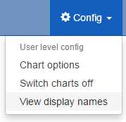
Figure 14: Switching charts off
The user can also switch off chart plotting by clicking on the
Switch charts off link in the User options menu in the navigation bar
at the top of any OpenREM page, as shown in figure 14.
The user can choose whether the data displayed on the charts is the mean,
median or both by using the drop-down Average to use selection. Only the
bar charts can display both mean and median together. Other charts display just
median data when this option is selected.
The charts can be sorted by either bar height, frequency or alphabetically by
category. The default sorting direction can be set to ascending or descending
using the drop-down list near the top of the chart options.
A user’s chart options can also be configured by an administrator via OpenREM’s user administration page.
Chart types - CT
- Bar chart of average DLP for each acquisition protocol (all systems combined)
- Bar chart of average DLP for each acquisition protocol (one series per system)
- Pie chart of the frequency of each acquisition protocol
- Pie chart showing the number of studies carried on each day of the week
- Line chart showing the average DLP of each study name over time
- Bar chart of average CTDIvol for each acquisition protocol
- Bar chart of average DLP for each study name
- Pie chart of the frequency of each study name
- Bar chart of average DLP for each requested procedure
- Pie chart of the frequency of each requested procedure
Chart types - radiography
- Bar chart of average DAP for each acquisition protocol
- Pie chart of the frequency of each acquisition protocol
- Bar chart of average DAP for each study description
- Pie chart of the frequency of each study description
- Bar chart of average DAP for each requested procedure
- Pie chart of the frequency of each requested procedure
- Bar chart of average kVp for each acquisition protocol
- Bar chart of average mAs for each acquisition protocol
- Pie chart showing the number of studies carried out per weekday
- Line chart of average DAP of each acquisition protocol over time
- Line chart of average mAs of each acquisition protocol over time
- Line chart of average kVp of each acquisition protocol over time
Chart types - fluoroscopy
- Bar chart of average DAP for each study description
- Pie chart of the frequency of each study description
- Pie chart showing the number of studies carried out per weekday
Chart types - mammography
- Scatter plot of average glandular dose vs. compressed thickness for each acquisition
- Pie chart showing the number of studies carried out per weekday
Performance notes
All chart types
For any study- or request-based charts, filtering using Acquisition protocol forces OpenREM to use a much slower method of querying the database for chart data. Where possible avoid filtering using this field, especially when viewing a large amount of data.
Bar charts
Switching off histogram calculation in Chart options will speed up bar chart data calculation.
Switching off Plot a series per system in the Chart options will speed up data calculation.
Scatter plots
Switching off Plot a series per system in the Chart options will speed up data calculation.